The Art & Science of Our Color Palettes
The Problem: Statistical vs. Artistic Palettes
Typical generators see pixels. Our AI sees art. Here's the difference.
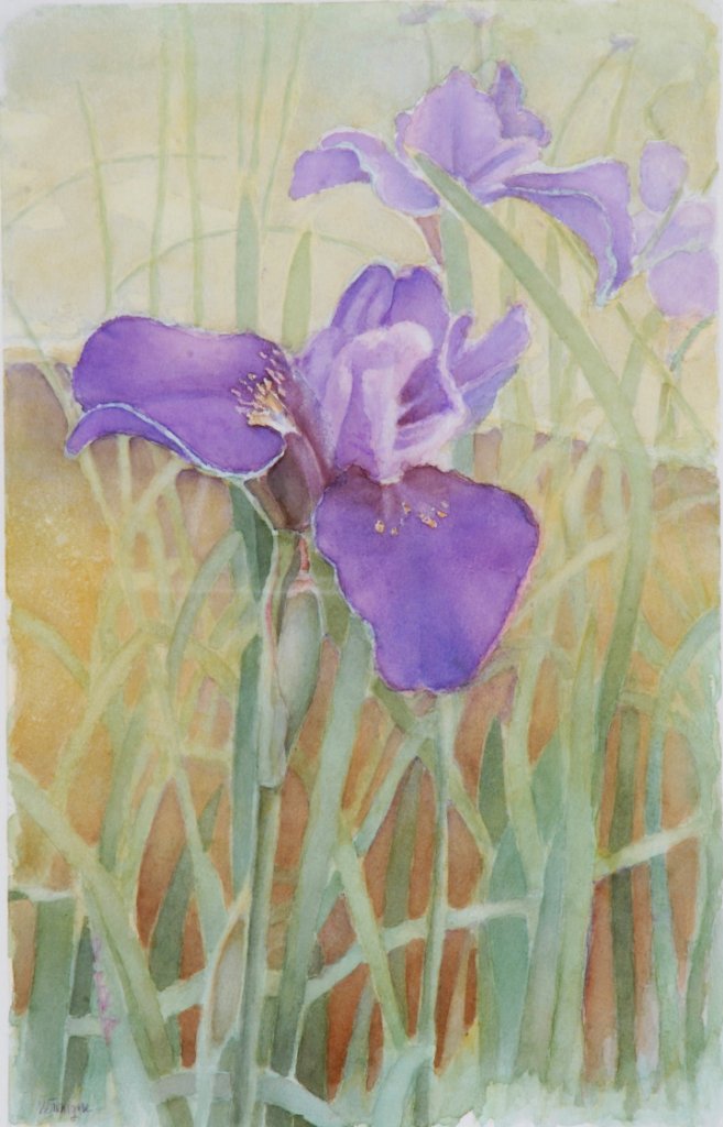
Iris Dreamscape
AID: VERON023
Bromont Media's AI Curator > Palette Examples
✓ Captures the vibrant iris purples AND the supporting blues, greens, and warm tones that give the piece its ethereal quality.
Popular Generator Comparison
✗ Misses the magical purple layers, greens, blues, and warm tones, and over-emphasizes muddy background tones. The result feels disconnected from the artwork's spirit.
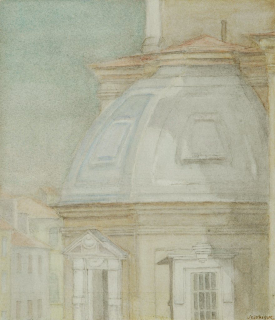
Timeless Florence
AID: VERON013
Bromont Media's AI Curator
✓ Captures the delicate sky blues, architectural stone tones, and subtle warm highlights that give this watercolor its refined, timeless elegance.
Popular Generator Comparison
✗ Completely misses the beautiful sky blues and architectural nuances, reducing this sophisticated watercolor to monotonous muddy browns.
The Bromont Media Difference: An AI Curator
We don't just extract colors. Our AI interprets art like a seasoned curator.
1. Contextual Visual Analysis
Our AI first analyzes the entire image for context—understanding the subject matter, composition, lighting, and overall mood before a single color is chosen.
2. Perceptual Weighting
Instead of just counting pixels, the system identifies colors that are 'perceptually significant.' It prioritizes tones that define focal points and create atmosphere, even if they are less frequent.
3. Aesthetic Harmony
Trained on millions of artistic compositions, our AI selects a set of colors that are not just dominant, but also harmonious. The final palette is balanced and representative of the artwork's true identity.
Side-by-Side Comparison
The difference is in the approach—and the results speak for themselves.
Generic Generators
Bromont Media's AI Curator
Why This Matters For Design & Decor
Trustworthy Representation
You can trust that the palette accurately reflects the artwork's feel, ensuring no surprises.
Effortless Decor Matching
Easily and confidently match the art with your existing decor, paint colors, and furniture.
Harmonious Atmosphere
Create a perfectly harmonized atmosphere in any room by choosing art based on a true color profile.
Deeper Connection
Connect more deeply with your chosen artwork, knowing you understand its foundational color story.


